3 of the Best and Worst Fonts for Printing « Back to list
When it comes to creating some printed marketing material, the type of font that we will use is often one of the last things on our mind.
The actual design and content is usually the first thing we consider and then it’s a case of deciding on colours and images.
Once all this is in place you might finally get round to considering the type of font to use.
Why is Type Font so Important?
The simple answer to this is – it is!! If your customers can’t easily read the leaflet, flyer, brochure, billboard or poster that you want them to read, then your message will be instantly lost.
Your text must be clear and easy to read but it should also fit with your overall brand identity.
To help give you an idea of fonts that work well in print, we have compiled a list of three of the best and worst fonts for printing. We see all sorts of fonts that go through our printers on a daily basis and we like to think that we have a good idea on what works well and what simply doesn’t work at all.
3 of the Best Fonts for Printing:
1. Century Gothic:
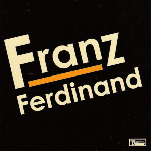
Century Gothic is a sans serif font that was created in 1991 for monotype imaging. Century gothic is neat and easy to read, making it a great choice for print material. It’s also a great choice for headlines and can be read from distance. Those of you familiar with the band Franz Ferdinand may be familiar with the Century Gothic font.
2. Helvetica:
Helvetica is probably one of the most commonly used type fonts and has been around since 1957. It is a widely used sans serif type that has a clean, simple feel to it and is easy to read. Helvetica is a great choice for more detailed information within a brochure or flyer. You may recognise Helvetica being used by a number of top brands including Microsoft, Panasonic, Staples and Evian.
![]()
3. Verdana:
Verdana is a font that was designed in 1996 by Matthew Carter for Microsoft and is another member of the san serif family. It was designed to be read on a screen but is also great for print due to its flexibility. It was designed with small text in mind so it’s an extremely legible typeface when it comes to printing. It looks good in large and small sizes and is a great choice if you want a consistent look to the headings and body of your text. You may recognise Verdana being used by PayPal.

3 of the Worst Fonts for Printing:
1. Comic Sans:
This once loved font is now well and truly a no go font. It tends to appeal more to a younger demographic and is quite popular in targeting kids but is a font that almost every designer will tend to avoid. It can be hard to read at times on paper if certain colours are used with it, with yellow particularly hard to make out. It was designed to look like comic book fonts and quite frankly this is where it should stay!
2. Segoe Script:
The main problem with Segoe Script is that it isn’t that easy to read and it’S also A struggle to complement it with other type fonts. Sentences can often come across as one long line of text which can easily result in the reader getting lost while reading the information they are after. While handwritten fonts can sometimes provide a stylish, rustic feel to the text, it is best to avoid using Segoe Script.
3. Impact:
Last but not least on our list is the Impact font. Another sans serif font, Impact was designed in 1965 as a font that would provide an impact when printed. With ultra-thick strokes and a compressed letter structure, Impact text can be very hard to make out and is a font we would certainly recommend avoiding when deciding on your printing needs.
When you have decided on a type font that works for your printed promotional material, we recommend you include it in your brand guidelines to ensure all future printed materials incorporate the same font and sizes.
Let us know which type fonts you enjoy using and which ones you try to avoid using by joining the conversation on Facebook and Twitter.
Use the hashtag #DigitalPrintFonts to share your favourite fonts with us.