Balance between images and text when designing flyers « Back to list
It can be an all too familiar conundrum – shall I go for a nice big photo or just use some text to get my point across. Designing a leaflet that will stand out can be a long process and there is no easy and quick way to design something that will instantly make an impact. It can be all too easy to go gung-ho with your design and create something that is big and bold and stands out for all the wrong reasons.
The key to designing a great flyer is finding the perfect balance of text and images. Consumers tend to use their senses a lot when making purchasing decisions. The sense of sight, smell and touch are often the 3 most important with taste and sound often used for specific products or industries such as music and food.
What is the perfect balance of text and images?
Getting the balance of text to images (or graphics) is an important part of creating any visual marketing tool. Whether you are creating a poster for an event, a billboard to promote a product or a brochure to showcase your products/services for your customers, the use of text and images and the visual strength of your final artwork will have a big say in its overall impact with your existing and prospective customers.
Your target market and the type of industry your business is involved in will also be a huge factor in how creative you can get. More creative and product focused industries such as retailers and designers will use more images and graphics to showcase their range. Professional and academic organisations however tend to opt for a more text based approach to flyers and brochures with images being used as an aid for the overall message.
Getting started:
When it comes to designing your next flyer, the first thing to consider is what your message will be. Each leaflet or flyer you create should have a message within it and a purpose. This may be promoting a sale or event or promoting your range of services.
When designing a leaflet, as a general rule you should have the following included:
• Some colour
• A headline
• Your logo
• Contact details
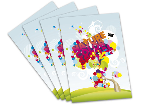
An image is not always a requirement but if used well, images can really enhance a leaflet or flyer. You can often make a leaflet stand out by getting creative with the text and particular your headlines. Take a simple flyer promoting a sale. Using the words “SALE NOW ON” and getting creative with your use of colour can be just as powerful as using an image.
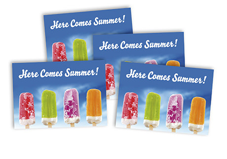
While it is perfectly acceptable to create a text only flyer that gets your point across, the addition of an image or some graphics can be extra eye-catching. It is important thought to ensure you don’t go overboard with your use of images or indeed text. Using too much graphics or images can sometimes overpower the text in your flyer while too much text can sometimes leave the reader feeling lost.
Put yourself in your customer’s shoes when designing your flyer. Read through it to ensure the key message is coming through. If your flyer feels too text heavy and you’re beginning to feel lost, then the chances are you’ve gone too far with your text. Likewise, if an image is just inserted so your flyer ‘looks pretty’ it’s time to rethink the role of an image (or images) on the flyer.
Finding the balance:
There is no doubt that using colour, graphics and images can help turn a dull flyer into a much more impactful flyer. The same could be said of text in that too much text can sometimes make a flyer seem dull, boring and too long to read. Using headlines and key points or prices will make your message more interesting. Use colour to highlight your key points and to guide your customer’s eye down the page.
A flyer needs to be short and to the point.
If your customer wants to read reams and reams of text they will get a book or newspaper. If they want to look at pretty picture they will go to Flickr or Instagram. A flyer needs to combine the visual appeal of imagery with the informative impact of text.
You can use one large image or a number of small images in your flyer but don’t go crazy. Sometimes one large image or graphic can get the same impact as 5 or 6 small images. The size and type of flyer you are designing may also impact on the number of images you use.
When it comes to adding text, follow the simple rule of keeping it short and to the point. Use headlines and sub headings to get the key message across and try to keep your word count relatively low. Aim for something below 100 words. This allows your customer to easily digest the message. The addition of contact details and a website will allow them to get more information when required.
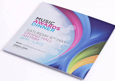
A quick recap:
• Only use relevant images
• Use colour to help text stand out
• Use headlines and sub headings for key points
• Keep text to below 100 words where possible
A flyer is used to intrigue your customer and leave them wanting to find out more. Don’t try to tell them the whole story on a flyer. If they want the full story they will seek further information.
How do you use images and text with flyers? Do you tend to focus more on images or text or do you try to get that nice balance and mix of both? Connect with us on Facebook and Twitter and let us know what is more important for you when creating a flyer.

