Getting the most from colour for your spring / summer leaflets « Back to list
Spring has certainly sprung and with summer just around the corner, the attention for many small, medium and large organisations, is their spring and summer promotions. For many, this will mean the beginning of the design process for leaflets with seasonal offers, and with spring and summer in mind, this can only mean one thing – colour. Today in the Digital Printing blog, we are going to take a look at the role of colour in helping your leaflets and flyers stand out in the coming months.
The role of colour when designing spring / summer leaflets
1. Bright and vibrant leaflets
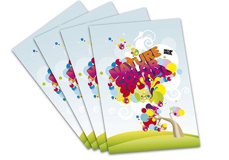
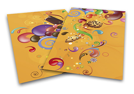
When you think of the spring and summer months, you instantly think of bright vibrant colours. Yellows, oranges, reds and dark purples remind us of the changing landscape around us and these colours can be extremely powerful when used in your leaflet design. These strong colours are often associated with the spring / summer months and consumers start to become very familiar with these bright, vibrant colours. Think of seasonal fashion trends and consider these colour trends when designing your leaflet in the coming months. Use colours that work well together to help promote your offering, but don’t go overboard with these ‘louder’ colours.
2. Colourful images
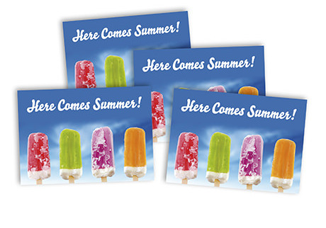
We previously looked at 7 ways images can help banners stand out, and colour and creativity was one area we focused on. Colour plays a big role in the impact images can have, and when you think of images for your spring / summer leaflet, think of bright, colourful images that relate to the time of the year. Let images add the colour that is needed to your flyer over the coming months, and let your text and background colours complement the colour within the images you will use. Images can also help to make an emotional connection with your audience, and this is highlighted in the leaflet below where the lollipop image plays a big role in letting us know that summer is on the way; perhaps even more so than the heading.
3. Add a little colour to your text
Text plays a big role in leaflets and flyers, and it’s important to use fonts that your audience will find easy to read and understand. Colour can also have a role to play when you are adding in your text, and if you use it subtly with headlines, it can really stand out and help get your message across. Adding bright colours to the text in your leaflets in the coming months can really help your offerings stand out. You don’t always need to use colourful text, but you can also use white text and a colourful background (like red) to further make your message or heading stand out.
4. The psychology of colour
Colour plays a big role when designing artwork for print, with warmer colours having an emotional connection with consumers. As previously mentioned, many of us will associate these warm, vibrant colours with the summer months and if you are creating seasonal leaflets or flyers, be sure to consider the psychology of colour among consumers. For more information on the psychology of these warmer colours, read our previous psychology of colour blog here.
The spring / summer months often present great opportunities for many industries and can often be the busiest periods for sales and enquiries for goods and services. Show your customers that you move with the times by creating a colourful, up to date, spring / summer leaflet, flyer, brochure or poster, that will encourage your customers to find out more about your seasonal offers.
Keep up to date with all the latest Digital Printing news by connecting with us on Facebook, Twitter and Google+.