5 things to consider when designing posters « Back to list
Previously in the Digital Printing blog, we looked at 5 things to consider when designing strut cards. To keep your creative juices flowing, and with Christmas and the New Year in mind, we wanted to turn our attention to posters. Posters can be a really powerful tool in creating some interest and buzz around your business and are particularly useful for creating awareness around a particular event. Whether they are used as an internal or external promotional tool, posters can be very effective in getting your message across.
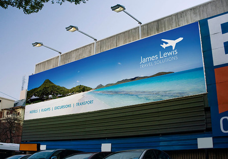
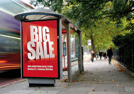
Posters can come in many formats but the most popular include indoor posters, outdoor posters and 48 sheet posters (usually known as billboards). These are often used by brands as a method of creating a real impact and are a visually powerful tool. Below, we look at five things to consider when it comes to designing your next (or first) poster campaign.
1. Purpose:
Let’s start with why are you actually making a poster; what is the purpose of it? Are you looking to promote a sale or let people know about a music concert or upcoming event? When designing a poster, you need to have an apparent vision of where you want to go with it and a message that will be crystal clear and easy for your customers to make out. When deciding on your message, ensure that any poster you design can be scaled up or down in size, allowing for a consistent design throughout, regardless of the type and size of poster you decide to use.
2. Your audience:
The next thing for you to consider is your audience. Who are you designing this poster for and what will they want to see? If you are designing something for parents then certain colours and images will impact on how you design it, as you want to establish an emotional connection with your audience. Put yourself in the shoes of your customers and target audience before getting started on your design. Try to brainstorm some ideas and see what you come up with.
3. Colour:
Let’s face it; one of the most impactful parts of a poster is the colour. As the example below (a promotional poster for the Smurfs 2 movie), colour can have a huge impact when used with posters. Colour can be a really powerful tool for posters if it ties in with your corporate or brand colours. Think of Coca Cola and we think of the colour red, tech company Apple and we think of white or airline provider Easyjet, and we think of orange. Colour can be a really powerful tool when designing a poster but don’t go overboard. Make sure you don’t have colours that will compete for the attention of your audience. Colour can also have a psychological impact on consumers and often impact on our emotions and how we feel. You can read more about his in our recent blog post on the psychology of colour when designing for print.
 (Image source: Moviecarpet)
4. Use of images:
Like colour, images can often be a great way of making an impact with posters and the two often go hand in hand. If you are using an image or photo in your poster, it is important to ensure it is of the highest quality and saved as 300dpi. Low quality images (e.g. 72dpi) are great for a computer screen and can look good on a website but when they are increased in size to be used in a poster or billboard, they can appear pixelated and lack quality. If you are planning on using images in a poster ensure they are high quality images (300 dpi) and saved in CMYK format, ready for print.
5. Text:
Last on our list and perhaps most important is text. The role of text in a poster is extremely important and will play a big role in whether or not you audience can understand your message. The font you choose must be easy to read up close and also easy to read from a distance (really important for larger poster formats including 6, 48 and 96 sheet). We would also recommend adopting a ‘less is more’ approach to adding text to a poster as your audience or likely to have a short period of time to take in your message. Be sure to get the key points across in your text and also ensure it is printed on a legible background. Don’t have text running throughout an image and avoid using light coloured text on a light background.
Make the right impression with a poster by remembering these five key points when it comes to designing it. Remember that posters can be great to use inside or outside your business and also work in multiple formats and size. Bear this in mind when designing as you will want design work to be at a minimum if you are scaling up or down in size.
Connect with us and keep up to date with all the latest news here at Digital Printing by following us on Facebook, Twitter and Google+.