5 ways to create a brochure your customers will want to read (the last one may surprise you) « Back to list
We recently discussed how to build the perfect brochure, and in today’s blog post, we’re going to talk about making a brochure your customers will want to read. This is a difficult task, regardless of what business you’re in. Content based marketing is a challenge both offline and online but online provides more multimedia based engagement methods, like video. It’s difficult for print to keep up and be as engaging as possible, unless you have right approach. We’ve put together 5 top tips to help you create a brochure that your customers won’t be able to put down!
5 tips to get customers reading your next brochure.
1) Keep it short and sweet
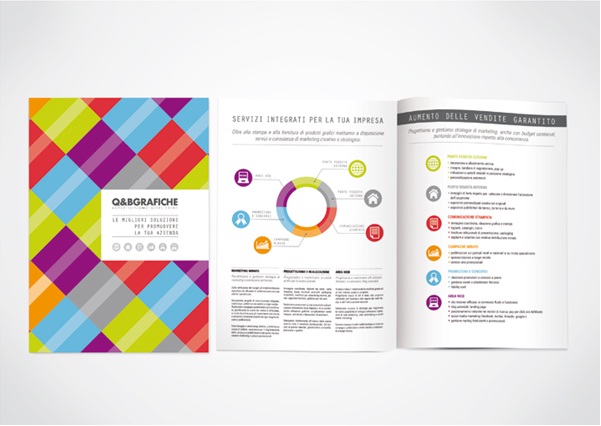
In a world where we are all moving at an almost instant rate, we expect things quicker, faster and neater. No one is prepared to read heavy text, which is why many would argue social networking sites like Twitter have been so successful – straight talking works! (For those of you who don’t use Twitter, it is a social networking site that forbids the use of anything past 140 characters).Using infographics to display your text is a great way to keep it to a minimum and make maximum impact.
2) Proof and copy
There is nothing your reader will penalise you more for than bad spelling and grammar. Here’s why. If you can’t be trusted to read and proof your own marketing material, how can you be trusted as a retailer or service provider? Spelling mistakes and bad sentence structure will create frustration and despair in your reader; they will give up on your brochure and will be likely to give up on you too. If you don’t feel that you have the in house time to do this well, outsource it to a professional.
3) Less negative, more positive
If you’re in a competitive business like e.g. hairdressing or beauty, don’t use negative language to describe services that you don’t offer. Instead, focus entirely on the positives of what you do offer and how this works. For example, if you use only natural products, don’t use your brochure as a space to be completely negative about unnatural products. Instead, create positive and engaging content. No one likes to be dictated too, but everyone likes to be informed.
 4) Formatting
Creativity is a great thing, when it is understood well. Don’t go overboard with sizes and styles of fonts and the colours used in a brochure. This is not creative; this is detrimental to your brochure, your reader and your business. Format your brochure well by using paragraphs when needed, readable and sensible font choices and always remain consistent. This will ensure your brochure is easy to read and digest, and will be an all round well received piece of information.
5) White Space
If you’re a regular to our blog, or even if you know the very basics about printing and design, you’ll be fully aware of the importance of white space. Yet, it still goes un-noted by some businesses. White space doesn’t actually have to be the colour white; it just has to be a blank space. This creates more space and makes the text easier to read. Cluttered brochures will disconnect the reader and your brochure will likely to see the bottom of a dustbin before your reader gets past the first page.
 (Image source: Graphic Design Sources)
If you’re thinking about designing and printing a brochure in the coming months, contact our friendly and knowledgeable team here at Digital Printing for expert advice. You can also keep up to date with all the latest Digital Printing news by connecting with us on Facebook, Twitter and Google+.