Importance of white space when designing a brochure « Back to list
We have previously looked at the role of proofreading, paper weight and colour when designing a brochure for print. One area that is often forgotten about when designing your printed marketing materials is the role of white space. It can sometimes be easy to go overboard with colour, images and headings to try and make an impact with your brochure. Rather than adopting this approach, sometimes it’s best to take a step back and let the words and images breath on your page.
How do you do this?
Simple; remember that white space is good.
The role of white space when designing for print
White space has often been seen as ‘wasted space’ or ‘negative space’ when there is space between certain parts of your page. For most companies, creating a brochure is about designing something that will be read. This means getting value for your money and in the past, white space and areas of a page that haven’t been used have been seen as wasting money. The old adage of ‘I’ve paid for it so I want to use it all’ is all too familiar when it comes to designing leaflets, flyers, brochures and posters. Many of you will have heard of the saying ‘less is more’. This is the approach you should start using when it comes to designing brochures and remember that white space isn’t all bad.
Let’s explore this further.
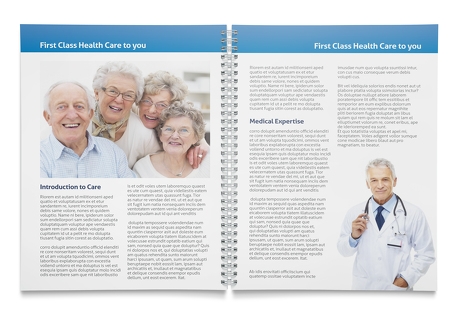
There are two types of white space – active and passive
1. Active white space: This is space that has been intentionally left to help create a better structure on your page and make your content more readable.
2. Passive white space: This is white space that has been left empty either around your page or between certain elements of the page. It is unlikely that this has been done intentionally.
The image below highlights the difference in layout between active and passive white space. The image in the left uses passive white space while the image on the right uses active white space. The addition of white space helps the page on the right hand side stand out and make a greater impact.
 (Images source: Radar Collective)
3 Reasons to consider white space when designing a brochure:
1. Help your pages stand out:
White is a great background to help make things stand out. Keep your creative simple and let your words and photos do all the talking. Using a white background will allow images to stand out much better than having a coloured background and multiple images. Rather than competing for your customer’s attention, let the white space work with your brochure rather than against it.
2. Provide your readers with direction:
One thing that white space is great at doing is providing your readers with a journey around your page. This is extremely important if you have lots of information for them to take in. Too much information can sometimes be off-putting to a reader. If the text is however necessary then make it easy for them to follow and add white space to break up paragraphs and different sections. This will improve the readability of your brochure.
3. A professional look and feel:
One final reason to consider the addition of white space in your brochure is that it helps provide a nice crisp and clean look to your final artwork. This helps make your brochure look much more professional and will help you make a good first impression with customers. A brochure that looks like time and thought has been given to its layout will more likely be read than one that looks like everything including the kitchen sink has been added to it.
Take these considerations on board when designing your next brochure and remember that white space can be your friend. Don’t view it as something that is negative or a ‘waste’. It’s also important to remember the impact of page bleed when considering the white space in your brochure. White space and particularly bleed also makes it much easier for printers when it comes to printing your final piece of artwork. For more information on creating production ready artwork for printers, read our guide here.
Connect with us on Facebook and Twitter to keep up to date with all things printing.