The role of colour when designing banner stands « Back to list
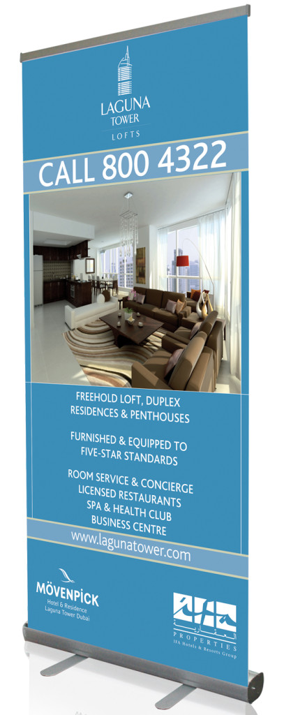
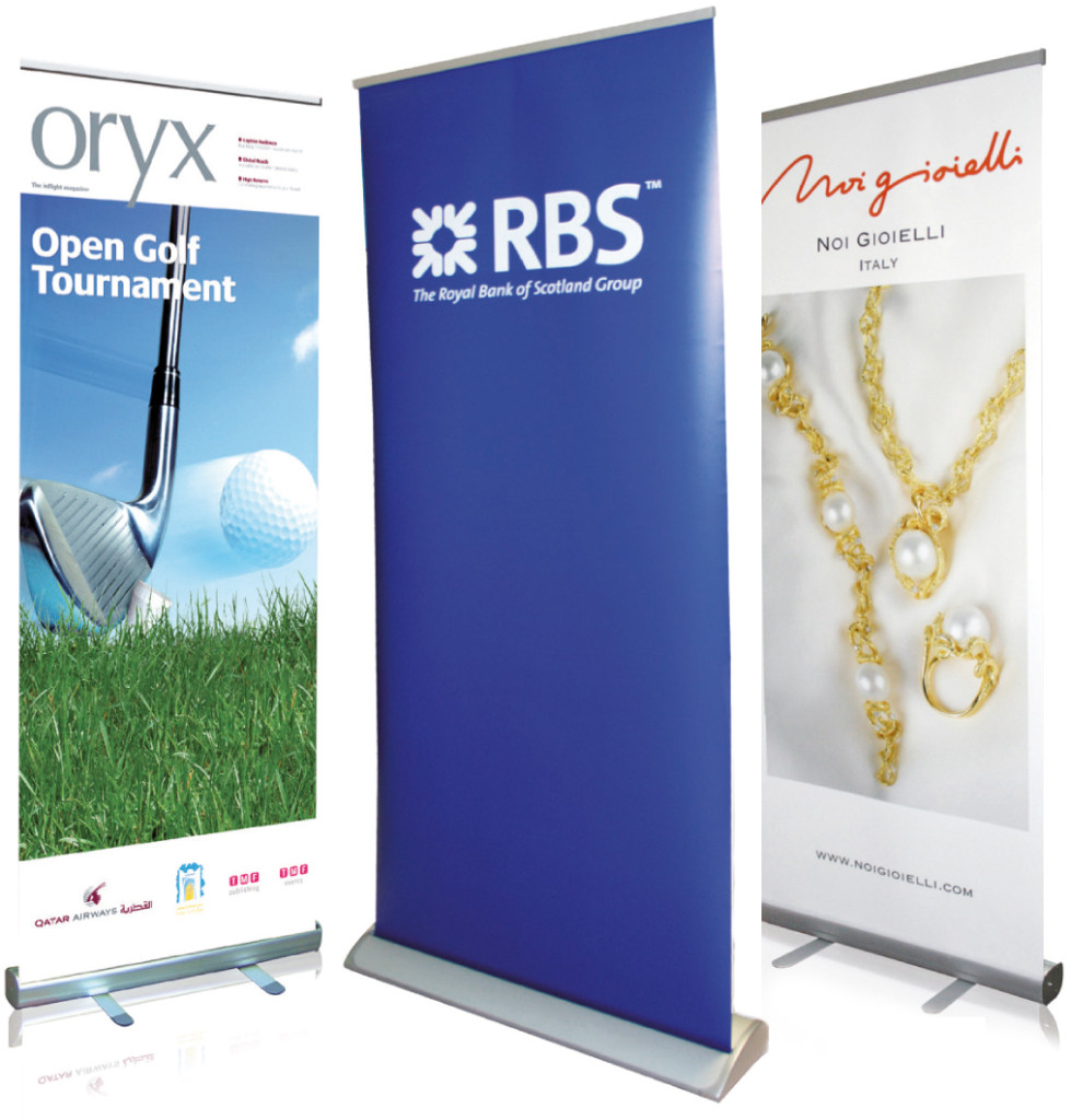
Banner stands come in two main types – pop up banner stands or pull up banner stands. While both can really help your brand and business stand out, there are many differences in pop up and pull up banner stands including, the size, the cost, and the time taken to set it up. There is lots to consider when it comes to designing a banner stand, particularly if you are looking to stand out at a trade show or exhibition. Banner stands can help you make a real impact and help your offering stand out both inside and outside your store. We recently looked at how the use of images can help make banners stand out and in this latest Digital Printing blog, we take a look at colour, as we look at the role it plays when deciding on the design of banner stands.
5 things to remember when using colour with banner stands:
1. Text is clear and easy to read:
It’s often easy to try to get creative with banner stands, especially pop up banner stands which provide you with a larger platform to promote your offering, but it’s important to make sure your information is easy to digest. This means that your text is clear and easy to read. One way to make this happen is to stick to legible text and background colours when highlighting key messages. Use colours that work well together to highlight your message, instead of using colours that will compete and make your message hard to read. Two colours to avoid using beside each other to promote your text message is yellow and white – this is simply a no go area!
2. Psychology of colours:
It’s also important to remember the role and psychology of colour when designing for print, and the impact that ‘warm’ and ‘cool’ colours have on the public, including your customers. Remember the impact that your own brand colours will have on your customers and the connection they have to your brand colours (think of Coca-Cola’s red). Colours like blue indicate strength, black indicates power, orange and yellow gives off an energetic feel, while pink is quite a feminine colour. It’s also important to consider colours that are easy on the eye (like green) and make sure when choosing a colour (or colours) for your next banner stand, that it works with your brand but will also fit with your industry and connect with your audience.
3. Know your audience:
Continuing on from the psychology of colour, another key area to consider when choosing a colour for banner stands is your audience. Who is your banner stand aimed at and what colours are popular within your industry. If you are targeting parents or advertising products aimed at young kids, lighter softer colours like pink, sky blue and peach are all popular colours to use. It is also important to consider the position of your customers either in store or at a trade show when designing your banner stand. Use colours and a design that will grab their attention either up close or from a distance. When designing a banner stand for an audience at a distance, keep the number of colours you use to a minimum to enable your message and brand to be much easier to see and consume.
4. Remember white space:
While colour can really help banner stands to make an impact and stand out, it’s also important to remember the use of white space in getting your message across to your audience. The colour of white is often associated with purity and cleanliness, helping to give your banner a clean and organised feel. White can also help create the illusion of a larger banner if used as a background, and it can often be a popular way to contrast richer, bolder colours.
5. Keep colours to a minimum:
Our final tip when using colours to design a banner stand is simple, don’t go overboard!! Don’t use so many colours that your banner ends up looking more like a rainbow than a promotional tool. The addition of colour can help your brand stand out and can make a nice change to your normal banner stand design. It’s important to remember not to add colour at the detriment of your overall message. Be sure any colours you add, fit with your overall brand image and help provide impact in your overall message, this is after all the most important thing when designing a banner stand – you want a message that existing and prospective customers can understand and act on. Just remember with banner stands that less can often be more.

For more information on the role of banner stands and how you can use colour to make them stand out, read our recent post on 5 ways to use banner stands. You can also visit our templates section for some ideas on getting started with your next banner stand design.
Keep up to date with all the latest Digital Printing news by connecting with us on Facebook, Twitter and Google+.