Text and banner stands – why less is more! « Back to list
Designing your banner stand is never easy; you need to consider images, colour, shape, size and perhaps most importantly; text. The text of your banner stand speaks to your audience directly and works to deliver your message instantly. Some businesses have a lot to say, and that’s great, but saying it on your banner is not the right answer.
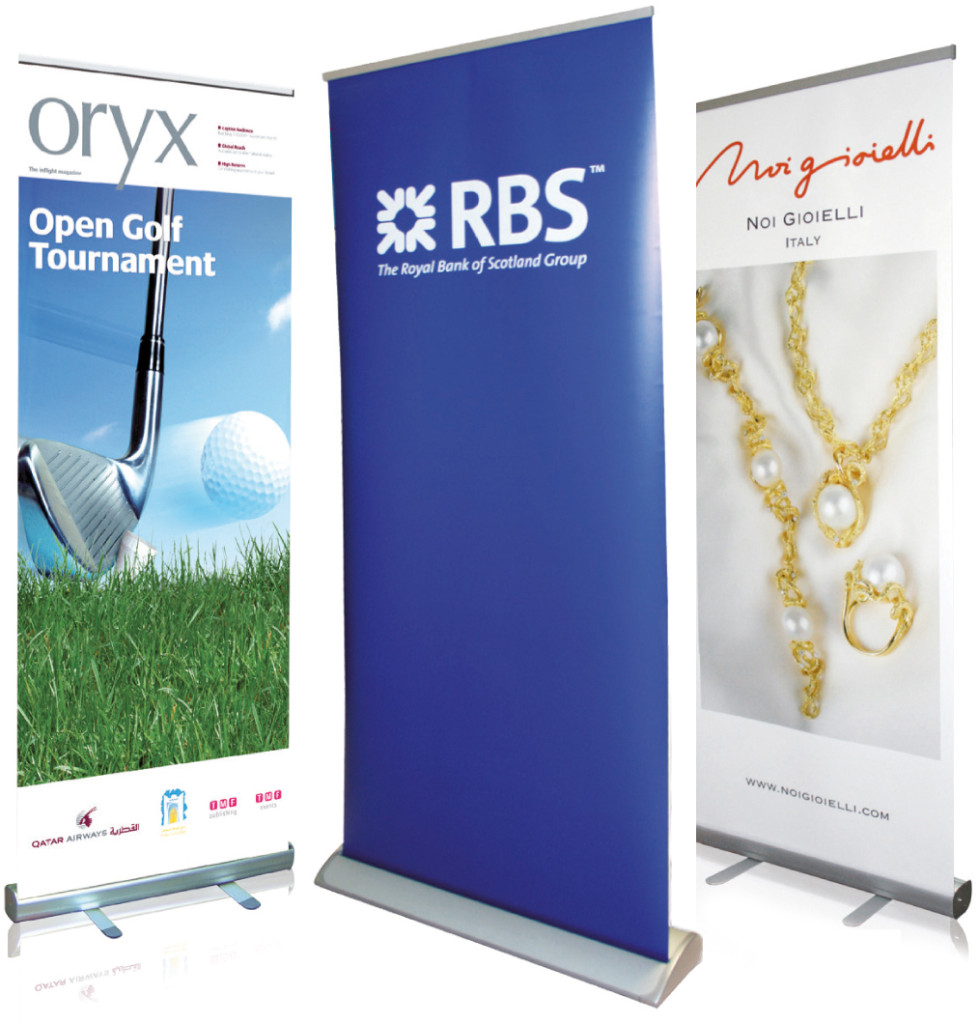
What’s the real use of banner stands?
A banner stand is used to connect with customers, either B2B or B2C. Some businesses will bring a banner stand to a conference or exhibition as part of their overall display. Using a banner stand like this will help you to stand out in this competitive environment. Other businesses will use banner stands internally, to connect with customers and provide them with information once they arrive into the place of business.
It doesn’t matter what your reasons are for choosing to create a banner stand, the text you decide to use, plays an important role. Let’s take a look at why this is.
Your business, your banner, your text
1. Less is more
We hear this phrase in the design world quite a lot, and rightly so. In today’s world, no one has time to be bombarded with images and text. People have no desire to read heavy text, even if they did have the time. Your banner stand should be short and snappy, enough to intrigue your reader and evoke curiosity.
2. Space is your friend
You don’t have space for heavy text on your banner stand, so attempting to fit in much more than a few keywords and phrases isn’t only unnecessary and off-putting, it is also highly impractical. There is nothing worse than spending your marketing budget on a high quality banner stand, only to deface it with lots of text. Be aware of your spatial boundaries when it comes to building a beautiful banner stand.
3. Getting the image/text balance right
They say a picture paints a thousand words, and with the right selection of images, you can deliver your message effectively without using too much text. Remember, don’t overdo the images though – keep an appropriate image/text ratio. Or, if you are only selecting one/two impactful images, keep text minimal and let your images do all the talking.
4. Use meaningful text
Don’t get tempted to use cheesy slogans or sales tactics for your banner stand. Instead choose text that represents your brand and delivers your message. It’s easy to use exclamation marks and bold font, but think about what your language says about the message you are delivering.
5. Avoid small print
No one reads small print! Unless you have a legal obligation to provide small print on your banner, save this for somewhere else, like your website or a leaflet. Using print that is unreadable will only aggravate potential clients or customers and push people from your business and your brand.
If you need advice on getting the most from your next banner stand speak to our expert team today. You can also keep up to date with all the latest news here at Digital Printing, by connecting with us on Facebook, Twitter and Google+.