5 Brochure designs that will spark your creativity « Back to list
We’ve all been there – sat looking at a blank piece of paper, scratching our heads while trying to think of something that your customers will want to read. Getting the design right for any type of printed promotional material can take time, and not everything will work. Printed brochures in particular can be challenging because you need to strike the right balance between creativity and information. You want your customers to be able to clearly read and understand what you are trying to tell them but at the same time you want something that really stands out, something no one else has done. This isn’t always easy.
Designing printed brochures
The big thing to remember when designing anything that is targeted at your customers is the core message. What is the purpose of it and what do you want your customer to do with it. As much as they can be a powerful branding tool, printed brochures are one of the most powerful marketing techniques for really telling a story, but how do you do this without putting your customers (or anyone who reads it) to sleep. Below we look at 5 brochure designs that have caught our eye in recent months. Take a look at just what makes them so different and why they stand out and use this as inspiration when it comes to designing your next batch of printed brochures.
1. IKEA pop up brochure
Famous for their flat pack furniture, Swedish home furnishing giants IKEA really got their thinking hats on when they came up with a brochure to promote a new range of flat pack furniture. How can you make flat pack furniture stand out on paper? Simple – you don’t make it flat. This wonderful pop up brochure highlights what can be done when you think about more than just the A4 page in front of you.
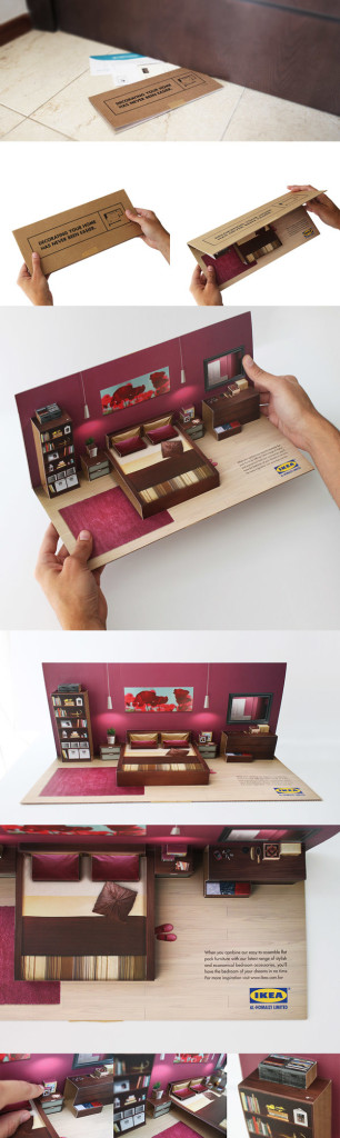 Image – Behance
2. Hilton food and beverages leaflet
Making food look really good on paper can be tough, but when it works it really works. Believe it or not we actually use all our senses when it comes to food from tasting and smelling food to touching it, looking at it and even listening to it being created. With a food brochure you only have the one sense (sight), so you need to make your brochure really strike a chord from a visual point of view. Let the food grab the reader’s attention and everything else (price, description, opening hours, etc) should all be a secondary selling point. Hilton Hotels do it wonderfully below by using different creative styles for different types of food. Connect with the different emotions your customers have for different types of meals.
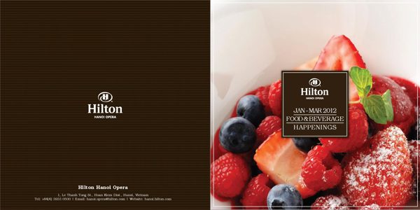
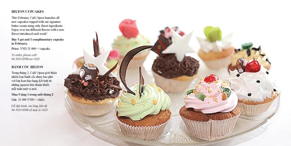
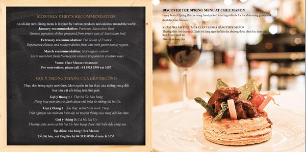 Image – Behance
3. Haworth Seating
Office seating may not sound like the most glamorous product but like everything else, it has a purpose. In their 2012 promotional seating brochure, Haworth Seating decided to let the seat be the hero (as it should be). No fancy text, no gimmicks, just a photo of the product in its natural setting (in this case an office) and a clear cut message on why this chair will help you. Seems simple but is extremely effective. Sometimes we forget to mention the benefits and why someone actually needs your product – don’t, it’s often your biggest selling point.
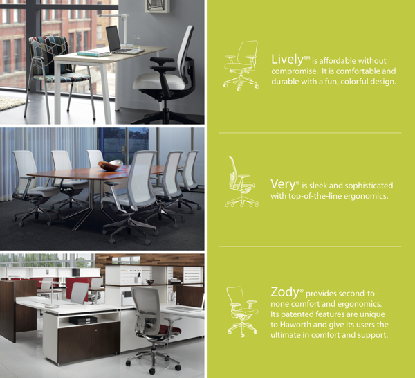 Image – Behance
4. World Wildlife Fund
The WWF (not the wrestling but the wildlife) often adopt a shock factor approach to their messages with big headlines aimed at grabbing our attention. This recent brochure looking at the extinction risk for birds and mammals shows the impact that text can have on a brochure. It’s not always about lots of colour, nice graphics and beautiful pictures. If you have an important message, put it in front of your customers in black and white! If the headline is strong enough it will grab their attention. This fold out brochure has a hard hitting cover, then opens up with a key message at two points – a very creative way of using paper folds to get a message across.
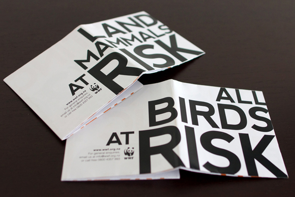
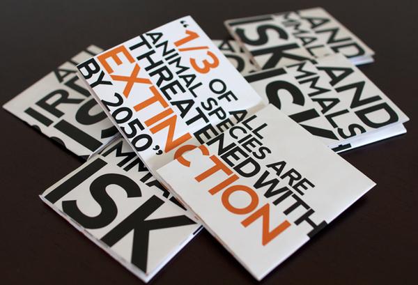
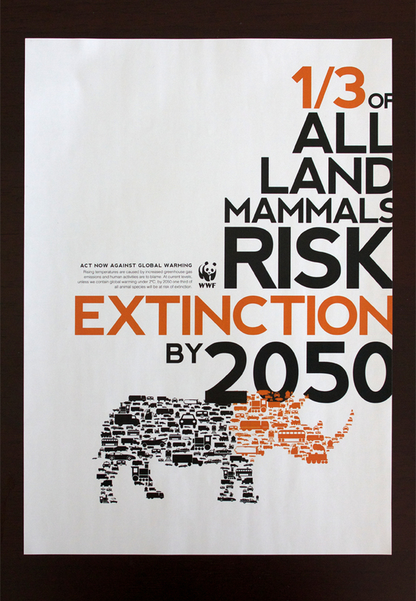 Image – Behance
5. Jeep
The motor industry is a great example of how to get the most from a brochure. Manufacturers like Audi, BMW and Renault are constantly updating their brochure designs to showcase their cars and features. In a competitive market such as the motor industry, how you design a brochure and highlight the benefits of your car can be the difference in getting a new customer or losing out to a competitor. The Jeep tyres are instantly recognisable and in the brochure below, Jeep have cleverly used the tyre as the focus of their brochure and the colour almost resembles the off road dust that you expect to see when driving a Jeep. These little things connect with the customer and something we can all learn from.
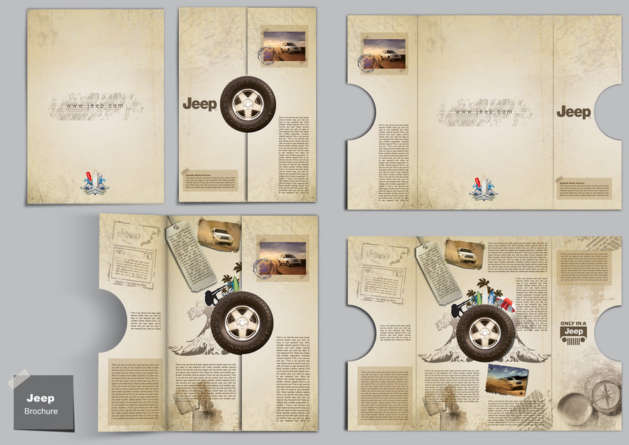 Image – Devianart
These brochures highlight the need to try something a little different. Nobody ever stood out by playing it safe. When you’re sitting down to design your next company brochure, take time to think about what makes you difference and what makes you stand out from your competitors. Use this as the inspiration for your design.
Keep up to date with all the latest news and offers here at Digital Printing, by connecting with us on Facebook, Twitter and Google+. Have you seen a brochure recently that should be on our list? Let us know by commenting below.